Wise Words:
“The greatest ideas are the simplest” - William Golding
This email gets into the 3 step CTA (call-to-action) formula to present your offer in a way customers will click and take action.
Turn AI into Your Income Engine
Ready to transform artificial intelligence from a buzzword into your personal revenue generator
HubSpot’s groundbreaking guide "200+ AI-Powered Income Ideas" is your gateway to financial innovation in the digital age.
Inside you'll discover:
A curated collection of 200+ profitable opportunities spanning content creation, e-commerce, gaming, and emerging digital markets—each vetted for real-world potential
Step-by-step implementation guides designed for beginners, making AI accessible regardless of your technical background
Cutting-edge strategies aligned with current market trends, ensuring your ventures stay ahead of the curve
Download your guide today and unlock a future where artificial intelligence powers your success. Your next income stream is waiting.
🔥What is a CTA?
A CTA is a call-to-action or specific action you want your audience to take.
This can be to sign up, subscribe, learn more etc.
By having a strong CTA, you get more viewers to follow your desired action.
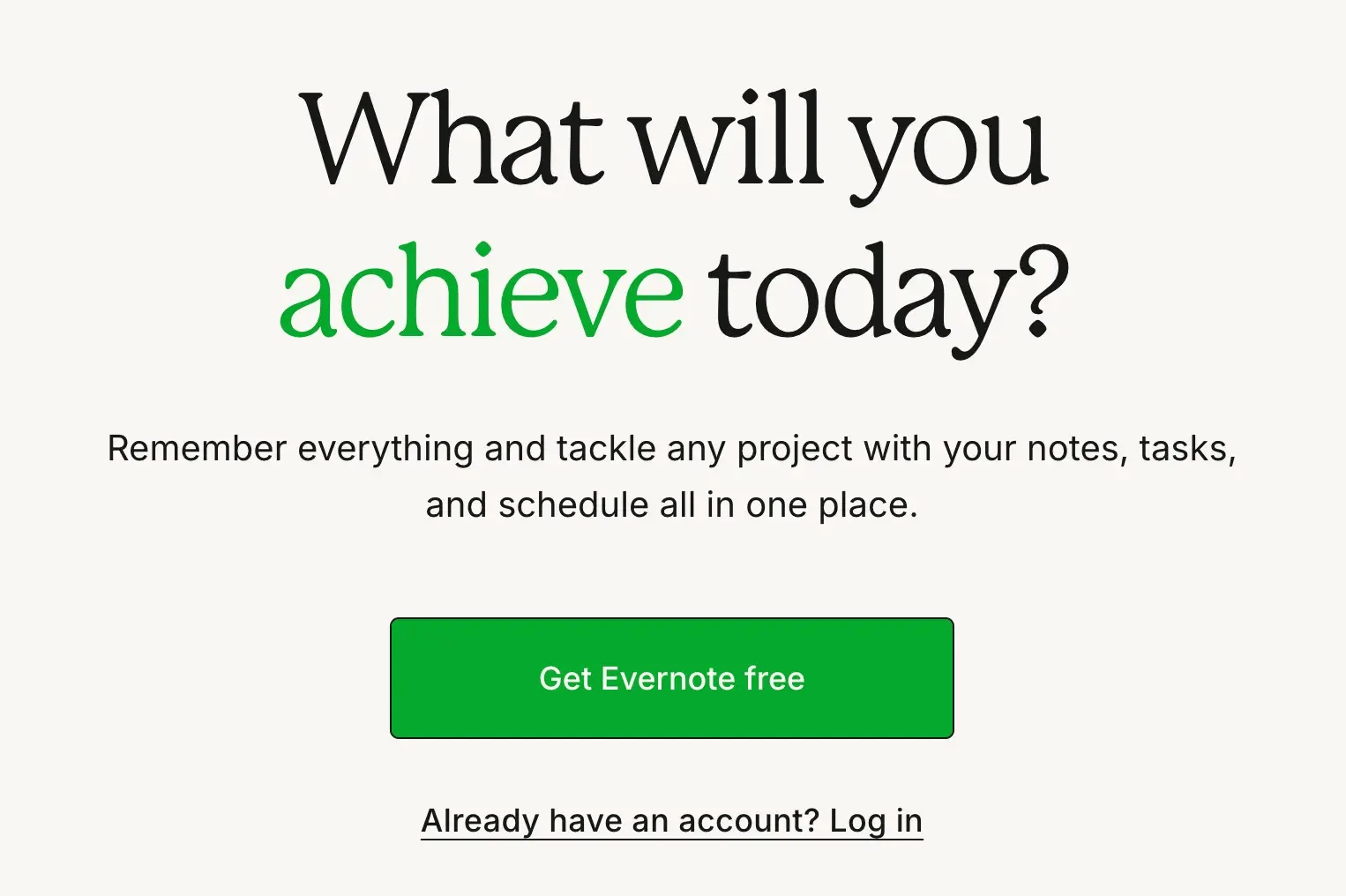
Curated Example: Evernote

Get Evernote free is the CTA asking viewers to click on the button and get access to Evernote.
🔥CTA Step #1: Turn your CTA into a benefit for the customer
Your CTA should show an intrinsic benefit. Yet, most businesses don’t give their customers a reason to click.
Including a benefit within the CTA will increase your clicks. I used the benefit of “Unlocking free access to the 150+ Ideas Database” within my CTA.

Pro Tip: Use strong verbs that highlight the benefit the customer gets. Instead of saying subscribe to membership say activate your membership. See a list of strong verbs and CTAs below.
CTAs that show benefits:
Unlock {valuable item}
Get {valuable item} Free
Sign up to {benefit}
Try {valuable item} free
Get {% discount} off
Discover {business}
Activate {membership}
Claim your {item}
By using these phrases, you make clicking seem like a benefit rather than a blatant advertisement or unnecessary task.
🔥CTA Step #2: Give specific (and dumb) instructions
Your call-to-action must be simple.
There are many clueless people who don’t know what to do. So, tell them exactly what they need to do.
The dumber the instructions, the better.
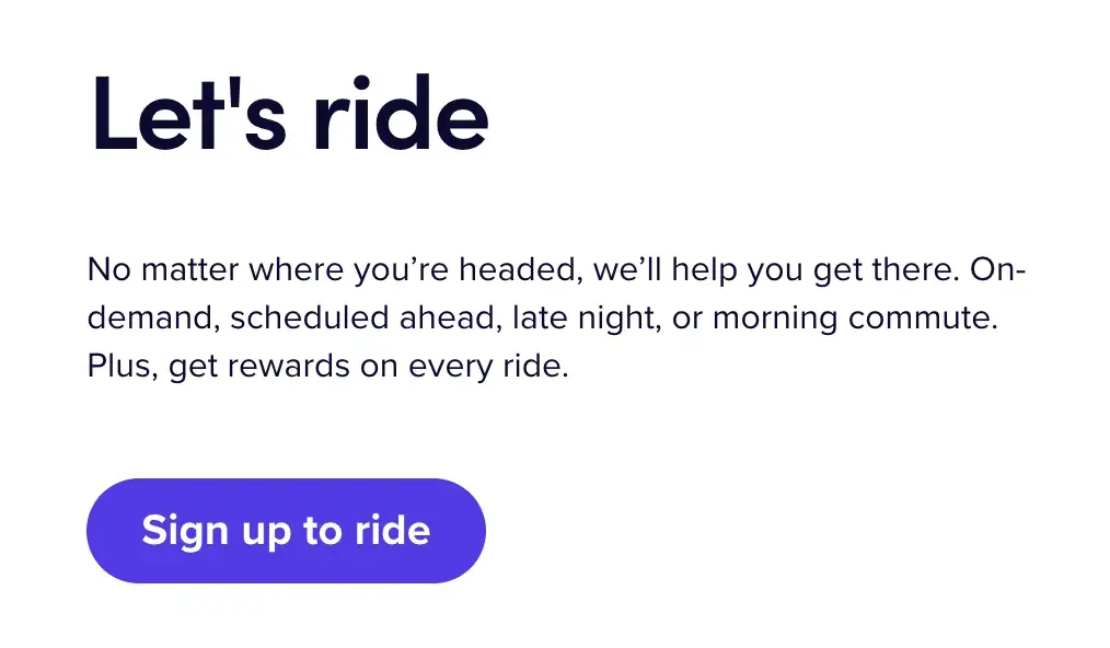
Curated Example: LYFT

LYFT is a carsharing business and it uses a clear CTA to sign up to ride.
It is obvious what customers should do (sign up) and what they get (a ride).
Using a specific CTA for an audience of riders increases the conversion of people who click and sign up.
🔥CTA Step #3: Make your CTA visually stand out
It’s common sense but your customers need to see your CTA to click on it. The worst mistake you can make is an unclear and hard-to-see CTA.
How to make a CTA stand out visually
Use buttons or have a separate box
Use a different color to create contrast
Put your CTA in most visible position (usually the center)
Give space around CTA
Make your CTA larger or bolder
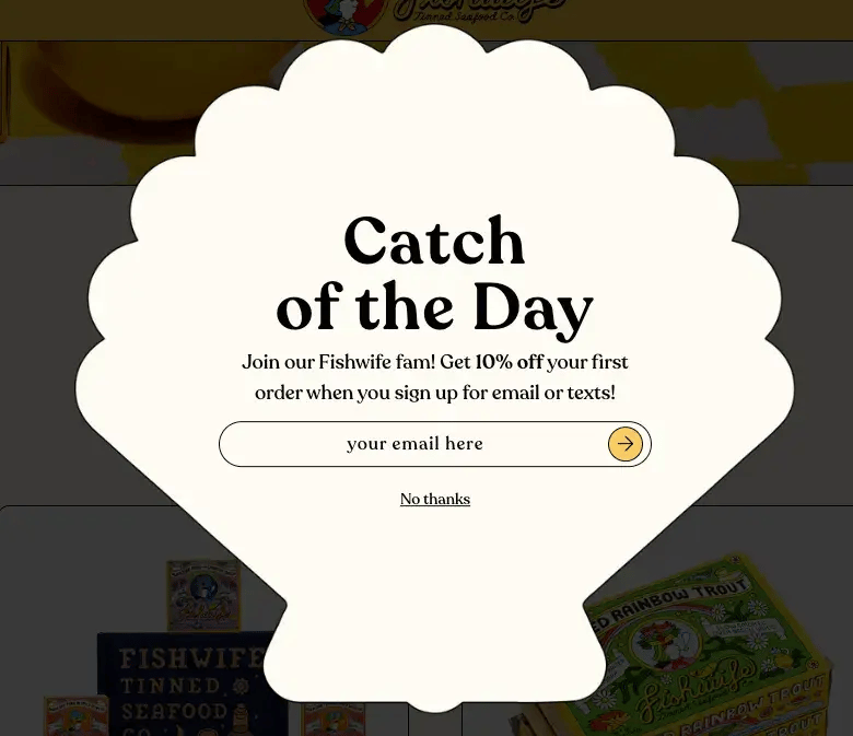
Curated Example: Fishwife Tinned Seafood

Fishwife created a CTA to sign up for their email list to get an extra 10% off.
They used an on-brand graphic of a seashell and the title “Catch of the Day” to highlight the benefits and make the CTA stand out.
One-Sentence Recap: Make a strong CTA by turning your CTA into a benefit for the viewer, giving specific (and dumb) instructions, and making the CTA visually stand out
Best,
Warren

